Painters Cape Town-Flavourful Hues: Trending Kitchen Paint Colours
Painters Cape Town: The Heart of the Home, Reimagined in Colour
In the vibrant tapestry of Cape Town living, the kitchen stands as more than just a place to prepare meals; it's the bustling heart of the home, a hub for family gatherings, entertaining friends, and creating cherished memories. As design trends evolve, so too does our approach to this pivotal space. For homeowners in the Mother City, selecting the perfect paint colours for their kitchen is a decision that balances aesthetics with functionality, reflecting both personal style and the unique character of Cape Town itself.
This comprehensive guide by Painters Cape Town delves into the most captivating kitchen paint colour trends for 2025 and 2026, offering insights tailored to the Cape Town aesthetic, incorporating popular South African paint brands like Plascon and Dulux, and ensuring your kitchen remains a stylish and inviting sanctuary.
The Evolving Kitchen Aesthetic: More Than Just White
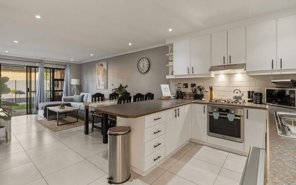
For years, white kitchens reigned supreme, celebrated for their timeless appeal and ability to create a sense of cleanliness and spaciousness. While white remains a classic, the current trend in kitchen design, particularly in Cape Town, is shifting towards palettes that feel more warm, grounded, and deeply connected to nature. According to Painters Cape Town, Homeowners are embracing colours that infuse personality, depth, and a sense of calm sophistication into their culinary spaces. This evolution reflects a broader desire for homes that are not only beautiful but also intentional, personal, and reflective of a conscious lifestyle.
Top Trending Kitchen Paint Colours for Cape Town Homes (2025-2026)
The 2025-2026 colour forecasts highlight a move towards rich, earthy, and comforting tones, perfectly suited to Cape Town's natural beauty and diverse architectural styles. Here are the key trends:
1. Warm Neutrals: The New Foundation of Sophistication
Bid farewell to cold greys; the era of warm, inviting neutrals is firmly here. These hues, encompassing mushroom, soft taupe, creamy almond, sandy beige, and warm stone, are taking centre stage. They offer a versatile and timeless base that complements both the abundant natural light of Cape Town and a wide array of interior styles, from contemporary apartments to traditional family homes.
• Why it's trending: Warm neutrals create a welcoming and effortlessly put-together feel, making them ideal for open-plan living spaces where the kitchen seamlessly blends into dining and lounge areas. They provide a sophisticated backdrop that allows other design elements, such as natural wood accents or textured ceramics, to shine.
• Cape Town Appeal: These shades resonate with Cape Town's appreciation for natural textures like wood and stone, reflecting light beautifully on overcast days while maintaining a cool ambiance under the summer sun.
• Key Application: Ideal for main cabinetry, walls, or even large islands to establish a calm, enduring foundation.
• Suggested Colours (Examples): Dulux Egyptian Cotton, Plascon Stonewashed.
2. Earthy Greens: A Connection to Nature
Green continues its strong presence in kitchen design, with a notable shift towards deeper, more organic tones. Olive, moss, forest, and muted sage greens bring a grounded, organic aesthetic that beautifully echoes the South African landscape, particularly in regions like the Winelands and coastal areas.
• Why it's trending: These greens evoke a sense of tranquillity and well-being, fostering a calm and inviting atmosphere. They are perfect for homeowners seeking a kitchen that feels rooted, modern, and full of character.
• Cape Town Appeal: Aligns perfectly with Cape Town's emphasis on natural materials and indoor-outdoor living, bringing the lushness of the surrounding environment indoors.
• Key Application: Excellent for feature islands, pantry doors, or accent walls to create a bold yet calming statement. Combine with warm stone countertops and brushed brass hardware for an elevated look.
• Suggested Colours (Examples): Dulux Olive Grove, Plascon Garden Path [3].
3. Deep Blues: Modern Elegance and Depth
Navy, midnight blue, and stormy blue tones are steadily gaining popularity, introducing sophisticated drama into the kitchen without overwhelming the space. These darker shades impart a luxurious feel, especially effective in homes with ample natural light, a common feature in many Cape Town properties.
Why it's trending: Rich blues add depth and elegance, making them a favourite for homeowners desiring a high-end, modern aesthetic. They can create a striking contrast and a focal point within the kitchen.
• Cape Town Appeal:
The serene beauty of Cape Town's ocean and sky can be subtly referenced through these deep blue hues.
• Key Application: Use deep blues on lower cabinets or a kitchen island to create contrast and anchor the space. Balance with lighter upper cabinets or open shelving. Gold, copper, or matte black hardware can further enhance the premium feel.
• Suggested Colours (Examples): Dulux's 2026
Colour of the Year 2026, Free Groove™, an airy light blue, and Slow Swing™, a meditative dark blue, are part of their "Rhythm of Blues" collection, offering versatile indigo shades.
4. Soft Terracotta and Clay Tones: Grounded Warmth
Warm, earthy terracotta-inspired shades are emerging as a significant trend for 2026. These colours infuse the kitchen with warmth, texture, and a beautifully grounded energy. They pair exceptionally well with natural elements such as stone, oak, textured tiles, and fluted cabinetry.
• Why it's trending: These tones bring a sense of the artisanal and handmade, aligning with the growing appreciation for craftsmanship and natural materials in interior design. They create a cozey yet sophisticated atmosphere.
• Cape Town Appeal: These tones are particularly well-suited to coastal homes and sun-filled interiors, resonating with the natural colour palette of the Cape landscape.
Key Application: Introduce terracotta in smaller areas like open shelves, feature walls, or bar units. Muted clay tones can be used for selected cabinetry to add gentle warmth. Complement with rattan accents, natural baskets, or soft lighting.
Suggested Colours (Examples): Plascon Sahara, Dulux Spiced Honey.
5. Black: Bold, Beautiful, and Textured
Black kitchens continue to be a strong trend for 2026, but with a renewed emphasis on texture. Matte finishes, soft-touch materials, and subtle grain add depth and sophistication without feeling harsh. When used thoughtfully, black is striking, refined, and incredibly modern.
• Why it's trending: Black offers a powerful statement of contemporary elegance. It can create a dramatic backdrop that allows other elements, such as metallic hardware or vibrant decore, to pop.
• Cape Town Appeal: Black works well in contemporary homes and luxury developments, providing a sleek and sophisticated aesthetic that complements modern Cape Town architecture.
Key Application: Balance black cabinetry with warm neutrals or wood accents to prevent the space from feeling too enclosed. Introduce dramatic stone countertops with bold veining and use layered lighting to keep the space inviting and functional.
Suggested Colours (Examples): Dulux Night Jewels, Plascon Black Bean.
6. Two-Tone Pairings: Balanced Design with Personality
Two-tone kitchens remain one of the most versatile and popular trends. Combining complementary colours creates visual interest, breaks up large blocks of cabinetry, and allows homeowners to express their personality without overwhelming the room.
• Why it's trending: This approach offers flexibility and dynamism, allowing for a play of contrasts and harmonies. It can define different zones within an open-plan kitchen or simply add visual intrigue.
• Cape Town Appeal: Two-tone designs work beautifully in open-plan spaces common in Cape Town, where colour plays a key role in shaping atmosphere and flow.
Top Pairings for 2026:
◦ Mushroom + deep olive
◦ Soft taupe + natural oak
◦ Midnight blue + warm stone
◦ Black + textured timber
◦ Sand beige + clay tones
The Cape Town Light Factor: How to Choose Wisely
Cape Town's unique light conditions, characterized by strong sunlight and often clear skies, significantly influence how paint colours appear in your home. What looks perfect on a swatch in a store might transform under the intense Cape light.
• Test, Test, Test: Always test paint colours on your actual kitchen walls, observing them at different times of day and under various lighting conditions (natural and artificial). This is crucial for making an informed decision.
• North-Facing Kitchens: These rooms receive consistent, bright light throughout the day. Cooler tones like blues and greens will feel fresh and vibrant, while warm neutrals will maintain their warmth without becoming overpowering.
• South-Facing Kitchens: These rooms receive less direct sunlight and can feel cooler. Warmer neutrals, terracottas, and even deeper blues can help to add warmth and depth to the space.
• East-Facing Kitchens: Enjoy bright morning sun. Colours will appear brighter in the morning and soften throughout the day. Consider slightly muted tones to avoid over-saturation.
• West-Facing Kitchens: Receive warm, intense afternoon light. Cooler tones can help balance the warmth, while warmer tones will feel even cozier and more inviting in the evenings.
Beyond Walls: Integrating Colour into Your Kitchen Design
While wall paint is a significant element, trending kitchen colours extend beyond just the walls. Consider integrating these hues into:
• Cabinetry: Painting cabinets is a transformative way to update your kitchen. Two-tone cabinetry, with darker base cabinets and lighter upper cabinets, is a popular trend.
• Kitchen Islands: A kitchen island painted in a trending colour can serve as a stunning focal point, adding a pop of personality to an otherwise neutral space.
• Backsplashes and Tiles: Incorporate trending colours through your choice of backsplash tiles, whether it's a subtle green subway tile or a terracotta-toned mosaic.
• Accessories and Decor: For those hesitant to commit to a bold paint colour, introduce trending hues through accessories like bar stools, pendant lights, kitchenware, or even fresh produce.
Tips from the Experts: Painting Your Cape Town Kitchen with Confidence
• Balance is Key: When using bold or deep colours, balance them with lighter elements (e.g., countertops, flooring, upper cabinets) to maintain harmony and prevent the space from feeling too heavy.
• Consider Undertones: Pay attention to the undertones of your chosen colours. A grey might have blue, green, or even purple undertones that will become more apparent under different lighting conditions.
• Finish Matters: The paint finish can dramatically alter the perception of colour. Matte finishes offer a soft, modern look, while satin or semi-gloss finishes are more durable and easier to clean, making them practical for kitchen walls and cabinetry.
• Professional Guidance: Don't hesitate to consult with professional painters or interior designers in Cape Town. They can offer expert advice on colour selection, paint types suitable for kitchen environments, and application techniques.
Conclusion: Crafting Your Culinary Masterpiece in Cape Town
The kitchen is truly the heart of a Cape Town home, and its colour palette sets the tone for the entire space. The trending hues for 2025 and 2026—from warm neutrals and earthy greens to deep blues, soft terracottas, and bold blacks—offer an exciting array of options to create a kitchen that is both stylish and deeply personal.
By considering the unique light and lifestyle of Cape Town, and by thoughtfully integrating these colours into your design, you can transform your kitchen into a culinary masterpiece that is not only on trend but also a true reflection of your taste and the vibrant spirit of the Mother City. Embrace these flavourful hues and let your kitchen tell its own captivating story.
Contact Painters Cape Town on 082 374 6862 for a FREE consultation.